|
Tools - Math 'Fault Finding and Fixing' Interpreting and Misinterpreting Data Tasks, Set #4 (solutions)
Percentages, Set #1 (solutions) || Combinations and Chance, Set #2 (solutions)
Interpreting and Misinterpreting Data: Set #3 (solutions) || Set #4 (solutions)
Malcolm Swan
Mathematics Education
University of Nottingham
Malcolm.Swan@nottingham.ac.uk
Jim Ridgway
School of Education
University of Durham
Jim.Ridgway@durham.ac.uk
|
Each question contains a selection of errors or misleading interpretations of data.
The aim of this assessment is to provide the opportunity for you to:
- explain clearly the source of each error or misinterpretation.
- rectify the errors and produce correct interpretations.
|
1. Equal opportunities?
The table below shows the percentages of public school principals and teachers who were women in the period 1984 - 1991.
|
Women principals
|
Proportion of all public school principals
|
|
|
|
|
Women teachers
|
Proportion of public school teachers
|
|
|
|
Write a reply to the following statement, explaining carefully why it is misleading. Be concise but convincing (give mathematical evidence to support your claims).
"The proportion of women principals in our public schools increased by 40% in the period 1985 to 1991, while the proportion of women teachers remained relatively stable. If these rates continue, it will soon be the case that one half of public school principals will be women and we will at last have equity in our school promotion system."
Solution:
The assertion that the proportion of women principals in public schools increased by 40% is based on the calculation:
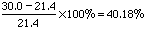
While this is correct, the increase in the proportions of public school principals that were women was a mere 8.6% (30% - 21.4%).
The language here is confusing as in the first instance we have a proportional increase expressed as a proportion of the original proportion! It is easy to confuse one result with the other and this is potentially misleading. Of course, these results give no information about the actual increase in number of women teachers as we don't know how many principals and teachers were employed in these periods.
It seems fair to say that the proportion of women employed as public school teachers remained fairly stable.
It is impossible to extrapolate this information with so few data points. It seems that some progress has been made towards equity, but there is a long way to go. Even if the 50% was obtained this would not mean equal opportunities for women. For equity, one would expect the proportion of women principals to reflect the proportion of women teachers. We would want to see the proportion of women principals reach 70% before such a claim could be made.
|
2. Smoking
The chart below resulted from a study of the smoking habits of men.
It shows data for about 1,000 men in each of four categories: non-smokers, and those who smoke 1 to 9, 10 to 39, or more than 40 cigarettes a day. It shows how many men would be expected to survive to each age.
For example, of 1,000 men aged 25 who do smoke more than 40 cigarettes per day, about 856 will survive to the age of 50.
|

|
|
Age
|
Number of survivors
|
|
Number of cigarettes smoked per day
|
| Zero |
1 to 9 |
10 to 39 |
More than 40 |
| 25 |
1000 |
1000 |
1000 |
1000 |
| 30 |
994 |
991 |
991 |
988 |
| 35 |
987 |
981 |
981 |
973 |
| 40 |
978 |
966 |
965 |
951 |
| 45 |
964 |
942 |
939 |
910 |
| 50 |
944 |
906 |
869 |
856 |
| 55 |
909 |
859 |
831 |
777 |
| 60 |
855 |
778 |
744 |
671 |
| 65 |
777 |
673 |
622 |
540 |
| 70 |
667 |
524 |
468 |
400 |
Source: E.C. Hammond, Journal of the National Cancer Institute, 43 (951-962) 1969.
Use the data in the table to write comments on the following four opinions. You should try to reply to each statement as fully and informatively as possible.
- I am 25 years old. I only smoke 5 cigarettes per day.
Smoking isn't going to affect me much at all.
- I am also 25. I am a heavy smoker (about 50 per day). I reckon that I might reduce my lifespan by two or three years, but its not that much really.
- I am 45 and smoke about 20 per day. I guess I stand about a 70% chance of reaching the age of 70. That is little different to a non-smoker.
- This table alone proves that smoking is a cause of early death.
Solution:
Suitable replies to each statement might be:
- I am 25 years old. I only smoke 5 cigarettes per day.
Smoking isn't going to affect me much at all.
The data shows that of 100 people like you who smoke 5 cigarettes per day, 524 will live to the age of 70. This compares with 667 for non-smokers. You may be reducing your chance of living to 70 from about 66% to about 52%, a difference of about 14%. Alternatively, inspection of the table shows that the same number of non smokers survive to 65 as light smokers to age 60.
- I am also 25. I am a heavy smoker (about 50 per day). I reckon that I might reduce my lifespan by two or three years, but its not that much really.
The same number of non smokers survive to 65 as heavy smokers smokers to age 55. (Some students might use the spreadsheet to calculate life expectancy reasonably accurately).
- I am 45 and smoke about 20 per day. I guess I stand about a 70% chance of reaching the age of 70. That is little different to a non-smoker.
Given no other information than the table, your chances of survival are 468�939 = 0.5 (approx) or 50%. For a non-smoker, your chances would be 667�964 = 0.69 or about 70%. Quite a difference!
- This table alone proves that smoking is a cause of early death.
The table alone does not prove that smoking is a cause of early death. There may be other associated factors involved. For example, those who smoke may also tend to lead less healthy, sedentary lifestyles and it may the lack of exercise that is the cause of early death.
3. Presidential Popularity

The following headline and chart appeared in the June 14, 1994 issue of USA Today newspaper.
Clinton approval rating up
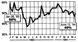
Source: USA TODAY/CNN/Gallup Poll of 756 adults by telephone on June 11-12. Margin of error: �4 percentage points.
The accompanying story, entitled "With Clinton home, voters lighten up," read in part:
With D-Day observances over and President Clinton back home, voters' attitudes toward the president are settling down a bit. Now that attention is back on the economy, health care and crises in Bosnia and Haiti, a USA Today / CNN / Gallup Poll taken over the weekend [of June 12] shows Clinton's job performance rating inching upward to 49%... It's an improvement from a poll taken [on June 6] as Clinton was in Europe marking the 50th anniversary of the Allied invasion of Normandy, which showed approval dropping to 46%...
Write a letter to the editor of USA Today explaining why the assertion "Clinton approval rating up" might be regarded as questionable or misleading. Be concise (editors prefer letters that are brief and to the point) but convincing (give mathematical evidence to support your claims).
Solution:
Student responses will vary considerably, but a central point should be a comparison between the poll's margin of error (�4%) and the magnitude of the change in popularity between June 6 and June 12 (only 3%).
The 4% 'margin of error' is usually a 95% confidence interval - that is to say, we can be 95% certain that Clinton's popularity was between 42% and 50% on June 6, and was between 45% and 53% on June 12. Therefore, assertions such as "Clinton approval rating up" and "It's an improvement" are not a valid conclusions from the poll data.
Students might note that it is possible (though not very likely) that Clinton's popularity could have actually decreased between the two surveys. In view of the margin of error, Clinton's popularity on June 6 could have been 50% instead of the poll's 46%, and his popularity on June 12 could have been 45% instead of 49%. While the poll indicates an increase by 3 percentage points, there is a small chance that the President's popularity might have actually decreased by 5 percentage points. Some students might calculate these probabilities accurately.
Here is a sample letter to the editor:
|
Dear Editor,
Your report of June 14 on the popularity of the President is inaccurate. You report his popularity has gone up since the 6th of June. However, according to your own data, the change in the President's level of popularity is insignificant and should not be reported as an increase.
The margin of error is used to indicate that if another poll were taken at the same time as the original poll, we can be very certain that the difference between the results of the two polls would be less than the margin of error.
In this case the 3% difference between the results of the two polls is less than the margin of error. Even if these two polls were taken at the same time we could have expected this kind of discrepancy between them. Therefore, there is a good chance that the difference between the polls is due to the nature of random sampling and not to changes in the average American's opinion of the President.
Sincerely,
Mary Q. Public
|
4. Accident Data
The following real data shows how the percentages of cars involved in traffic accidents is related to the speed at which they were driving.
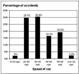
Explain why the following claim cannot be made from this data:
" The graph clearly shows that it is safer to drive at over 60 mph than to travel within the speed limit."
Solution:
The fact that a smaller proportion of accidents occur at extreme speeds (both fast and slow) is partly due to the fact that fewer cars travel at these speeds for any substantial period of time.
In addition, the graph says nothing about the safety of driving at a particular speed. Two cars are rarely traveling at similar speeds when they collide - so how can we say which is 'safer'?
The data therefore cannot support the claim.
Percentages, Set #1 (solutions) || Combinations and Chance, Set #2 (solutions)
Interpreting and Misinterpreting Data: Set #3 (solutions) || Set #4 (solutions)

|