|
Tools - Math 'Fault Finding and Fixing' Interpreting and Misinterpreting Data Tasks, Set #4
Percentages, Set #1 (solutions) || Combinations and Chance, Set #2 (solutions)
Interpreting and Misinterpreting Data: Set #3 (solutions) || Set #4 (solutions)
Malcolm Swan
Mathematics Education
University of Nottingham
Malcolm.Swan@nottingham.ac.uk
Jim Ridgway
School of Education
University of Durham
Jim.Ridgway@durham.ac.uk
|
Each question contains a selection of errors or misleading interpretations of data.
The aim of this assessment is to provide the opportunity for you to:
- explain clearly the source of each error or misinterpretation.
- rectify the errors and produce correct interpretations.
|
1. Equal opportunities?
The table below shows the percentages of public school principals and teachers who were women in the period 1984 - 1991.
|
Women principals
|
Proportion of all public school principals
|
|
|
|
|
Women teachers
|
Proportion of public school teachers
|
|
|
|
Write a reply to the following statement, explaining carefully why it is misleading. Be concise but convincing (give mathematical evidence to support your claims).
"The proportion of women principals in our public schools increased by 40% in the period 1985 to 1991, while the proportion of women teachers remained relatively stable. If these rates continue, it will soon be the case that one half of public school principals will be women and we will at last have equity in our school promotion system."
|
2. Smoking
The chart below resulted from a study of the smoking habits of men.
It shows data for about 1,000 men in each of four categories: non-smokers, and those who smoke 1 to 9, 10 to 39, or more than 40 cigarettes a day. It shows how many men would be expected to survive to each age.
For example, of 1,000 men aged 25 who do smoke more than 40 cigarettes per day, about 856 will survive to the age of 50.
|

|
|
Age
|
Number of survivors
|
|
Number of cigarettes smoked per day
|
| Zero |
1 to 9 |
10 to 39 |
More than 40 |
| 25 |
1000 |
1000 |
1000 |
1000 |
| 30 |
994 |
991 |
991 |
988 |
| 35 |
987 |
981 |
981 |
973 |
| 40 |
978 |
966 |
965 |
951 |
| 45 |
964 |
942 |
939 |
910 |
| 50 |
944 |
906 |
869 |
856 |
| 55 |
909 |
859 |
831 |
777 |
| 60 |
855 |
778 |
744 |
671 |
| 65 |
777 |
673 |
622 |
540 |
| 70 |
667 |
524 |
468 |
400 |
Source: E.C. Hammond, Journal of the National Cancer Institute, 43 (951-962) 1969.
Use the data in the table to write comments on the following four opinions. You should try to reply to each statement as fully and informatively as possible.
- I am 25 years old. I only smoke 5 cigarettes per day.
Smoking isn't going to affect me much at all.
- I am also 25. I am a heavy smoker (about 50 per day). I reckon that I might reduce my lifespan by two or three years, but its not that much really.
- I am 45 and smoke about 20 per day. I guess I stand about a 70% chance of reaching the age of 70. That is little different to a non-smoker.
- This table alone proves that smoking is a cause of early death.
3. Presidential Popularity

The following headline and chart appeared in the June 14, 1994 issue of USA Today newspaper.
Clinton approval rating up
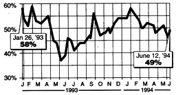
Source: USA TODAY/CNN/Gallup Poll of 756 adults by telephone on June 11-12. Margin of error: ±4 percentage points.
The accompanying story, entitled "With Clinton home, voters lighten up," read in part:
With D-Day observances over and President Clinton back home, voters' attitudes toward the president are settling down a bit. Now that attention is back on the economy, health care and crises in Bosnia and Haiti, a USA Today / CNN / Gallup Poll taken over the weekend [of June 12] shows Clinton's job performance rating inching upward to 49%... It's an improvement from a poll taken [on June 6] as Clinton was in Europe marking the 50th anniversary of the Allied invasion of Normandy, which showed approval dropping to 46%...
Write a letter to the editor of USA Today explaining why the assertion "Clinton approval rating up" might be regarded as questionable or misleading. Be concise (editors prefer letters that are brief and to the point) but convincing (give mathematical evidence to support your claims).
4. Accident Data
The following real data shows how the percentages of cars involved in traffic accidents is related to the speed at which they were driving.
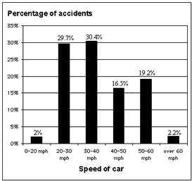
Explain why the following claim cannot be made from this data:
" The graph clearly shows that it is safer to drive at over 60 mph than to travel within the speed limit."
Percentages, Set #1 (solutions) || Combinations and Chance, Set #2 (solutions)
Interpreting and Misinterpreting Data: Set #3 (solutions) || Set #4 (solutions)

|